There are three primary types of style sheets as follows:
- Browser. The browser style sheet is the default style of a given browser. It is either an actual .css file such as we find in Mozilla browsers, or hard coded into the software. Browser styles are different between browsers and versions, so being aware of them is extremely important. Wherever you do not supply a style, the browser style will be used instead.
- User. User style sheets are a great concept that has unfortunately not been brought to bear on a large scale. User styles are meant for accessibility purposes. My aging eyes require larger text and higher contrast, I can write a quick style sheet to address my issues and apply it via the browser.
- Author. The author is you! That is, author styles are those styles that the developer or designer is in charge of creating to create the design and management scenarios for a given Web site or application.

At some point you might have come across the !important (referred to as "bang important") keywords. The proper use for !important is to create a balance between author and user style sheets, a necessity for accessibility purposes. If used in an author style sheet but not a user style sheet, the author's rule is considered to have more weight and therefore will apply. Because of this, !important is useful only in two places: As a diagnostic tool which you remove from the declaration after debugging a problem; and in a user style sheet. Otherwise, please avoid usage at all costs.
Author Style Sheets by Type
There are three types of author style sheets: Inline, embedded and linked (external). Each is authored differently and has different applications, benefits, and concerns.
Inline Style
Inline style is style that is used directly in the markup document to style one discrete element. No matter what other style sheets might be influencing the document, an inline style is considered more specific and therefore will apply to that element no matter other conflicting styles.
Consider the following paragraph element:
<p>This paragraph is styled only by default
browser styles</p>
The style is placed within the style attribute as a value:
<p style="color: blue;">This paragraph will now
have a blue color.</p>
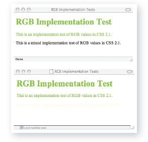
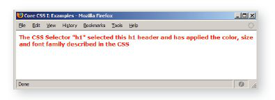
Figure 6 shows the comparison.

Figure 6. Applying style to a discrete element using inline style.
If you're thinking "but that code really looks just like presentational markup!" give yourself a big pat on the back. In recent years, many people, including those at the W3C responsible for advancing markup and CSS, have advised that using this technique isn't really separating presentation from the document at all!
So what benefits does inline style really offer? Table 4 provides some best practice insights as to when to avoid and when to use inline style.
| Scenario |
Issues |
Best Practice |
| Inline style in small versus large Web sites |
If you have a very small site (10 documents or less) the risk of losing track of inline styles is less than if you are working on very large sites, where it's easy to lose track of inline styles unless they are meticulously documented. And who does that? |
Avoid use of inline style in almost all professional web sites, and in particular those sites which are large or expected to grow significantly. |
| Inline style for debugging purposes |
As the section on "specificity" will demonstrate, an inline style has the highest specificity of any other rule that might be trying to style the element in question. If you are having trouble getting to the heart of the matter, dropping an inline style into the element you are having trouble with can help determine that in fact, there's a conflict. |
Use inline style when necessary to debug. Typically, if you are able to apply a style inline that you'd been struggling with before means you have rules conflicting somewhere that need to be found. Find the conflicts, repair the rules, and remove the diagnostic inline style prior to publishing! |
| Inline style as "quick" fixes (aka laziness) |
There are very few benefits from using inline style, but one I find that's great is for quick fixes and blog posts, which you can do on the fly. |
Despite the fact that I do this myself, it's not something I'd recommend, particularly for professional sites. |
Table 4. Best Practices: Inline Style
Embedded Style
Embedded style is used to control the style of a single document. In this case, the style element is used to define the embedded area for the document's style as follows:
<!DOCTYPE html PUBLIC --//W3C//DTD XHTML 1.0 Strict//EN-
"http://www.w3.org/TR/xhtml1/DTD/xhtml1-strict.dtd">
<html xmlns="http://www/w3/org/TR/xhtml1">
<head>
<title>Core CSS I: Examples</title>
<style type="text/css">
p {color: blue;}
</style>
</head>
<body>
<p>In this case, all paragraphs on the page will
turn blue.</p>
</body>
</html>
So as with inline style, we're left looking at a type of style sheet that, while handy in some cases, doesn't provide the benefits we're looking for. With the style element in the head portion of the document, we do achieve slightly better separation of presentation from our document's content and structure, but only in that same document. Table 5 provides some insights into the best ways to use embedded style.
| Scenario |
Issues |
Best Practice |
| Embedded style in small versus large Web sites |
If you have a weblog with one template document that controls your entire site, it is feasible to use embedded style in this instance. However, in any professional site or app development, avoid using embedded style, for it, like inline style, can contribute to confusion when debugging. |
Avoid in professional practice. |
| Embedded style for debugging and workflow purposes |
As with inline styles, if you're trying to isolate why a given style isn't applying, you can use embedded style to work through some conflicts. Another use that I find helpful is that during development, I like to work in one document, embedding my styles and building out the content and markup all in the same place. |
Though not ideal, embedded style can be used to debug and find conflicts in the case of multiple style sheets. Workflow advantages as described can be useful, the one caveat in all instances of professional sites: Remove your embedded styles out to appropriate external styles after you're done working, test, and you're good to go. |
| Embedded style as "quick" fixes (aka laziness) |
Where is that style? What if you want to use it again more efficiently? |
Avoid publishing embedded style sheets. |
Table 5. Best Practices: Embedded Style
Linked (External Style)
Linked style is the true "holy grail" of style sheet types. It provides us with the broadest application of style; allows us to manage the presentational aspects of a site from a handful of style sheets; performance is faster due to the browser placing the styles into memory (cache); and the worst of conflicts are avoided. Linked style sheets are separate text documents containing your style rules, saved with a .css file extension and linked to from the HTML documents you want to style using the link element in the head portion of your markup document:
<head>
<link rel="stylesheet" type="text/css" src="style/
global.css">
</head>
In almost all cases, the linked style sheet is the one you will be working with most.

Be careful with case matching between your CSS and HTML documents. If you create a selector H1 in upper case, then it will only select h1s in upper case within the markup documents. Best practices suggest keeping all HTML elements and attribute names in lower case (this is required in XHTML) and keeping CSS lower case as well, helping to avoid potential case-related conflicts. Also, while many programmers find camel case (class="ModuleTwo") intuitive, this also can cause casematching problems, particularly in larger-scale sites, particularly those being managed by multi-person teams.
Application Hierarchy and Sort Order
Of course, most working Web developers and designers are well aware that working with CSS just can't be that straight forward! There are many reasons why CSS is as broad in scope as it is, but flexibility and power are two of the most credible reasons for why you can approach a given problem with numerous solutions. With freedom comes responsibility, and the same is true for professional Web development.
In order to visualize why CSS can quickly fall from powerful friend to chaotic foe, consider Figure 7.

Figure 7. Imagine a global style for the University itself. Then, each individual department wants its own identity. This is a very common large-organization issue, and one which inevitably leads to multiple styles all over the site, poorly documented and managed when in fact some intelligent coordination could be used to manage the site's presentation much more efficiently.
The Cascade
Revisiting the browser, user, author relationship, we can take a look at how rules "cascade" from one style sheet type to another. Here's the general rule of thumb:
- All explicit styles override browser style
- A user style sheet, when properly authored, will override author style
- An inline style overrides a conflicting embedded style
- An embedded style overrides a conflicting linked style
Rule Order
The order in which rules are sorted becomes critical in resolving conflicting rules. Many readers are likely to have heard "the rule closest to the content wins",which is somewhat accurate but also a bit misleading.
Sort order, the term that is used to describe the sorting of multiple CSS rules, is the process by which a Web browser sorts the rules it is given. If we have a scenario where there are two linked style sheets, an embedded sheet in the document in question, and an inline style, the browser has to sort through those and resolve sort conflicts. Consider this XHTML :
<!DOCTYPE html PUBLIC --//W3C//DTD XHTML 1.0 Strict//EN-
"http://www.w3.org/TR/xhtml1/DTD/xhtml1-strict.dtd">
<html xmlns="http://www/w3/org/TR/xhtml1">
<head>
<link rel="stylesheet" type="text/css" src="style/global.css" />
<link rel="stylesheet" type="text/css" src="style/local.css" />
<style type="text/css">
p {font-family: Times;}
</style>
</head>
<body>
<p style="font-family: Arial;">Which font will this be?</p>
<p>What about this paragraph?</p>
</body>
</html>
If you imagine all the rules within global.css expanding out, then the local.css expanding out, then the embedded style added onto that, you get one long style sheet. If somewhere in the first two I had conflicting rules that styled paragraphs using the Geneva font, the sort order process will see the last style in that long sheet as Times. Therefore, Times will be used in all instances of p as defined within our scope with the exception of the element containing the inline style. As mentioned earlier, inline styles are more specific, and therefore will always "trump" another style in a scenario like this.
Specificity
There is one final deal-breaker for the rules of Cascade and sort, and that is the specificity of a given selector. I've kept the examples here simple for a reason as selectors are complicated and actually take up about a third of the Core CSS series.
Specificity is an algorithm with a broad base that allows an author to create very specific rules. These rules often involve a number of selector types, and are calculated based on the selectors in use in the rule. If a rule is found to be more specific than one that comes later in the sort order the more specific rule is applied no matter where the rule resides in the sort.
Consider the following rule:
#content p {font-family: Garamond;}
This is a combination of an ID selector (#content) and an element selector (p). The space between the two selectors indicates a descendent. So, let's say I have this rule in global.css. Because it is more specific, any paragraph that descends from an element with an ID of #content will now be in Garamond, not in Times.
Specificity is one of the terribly misunderstood and undertaught portions of conflict resolution within a CSS application hierarchy. Understanding how to calculate specificity is easier if you have a table available to work through a given conflict, then count up the types of selectors that exist in your rules in the exact order shown in Table 6.
| Example |
Count # of ID Selectors |
Count # of Class Selectors |
Count # of Element Selectors |
| ul |
0, |
0, |
1 |
| #content ul li |
1, |
0, |
2 |
| #content ul li ul li |
1, |
0, |
4 |
Table 6. Calculating Specificity
We can now see that the most specific rule is the last one. Therefore, any list item style that is not as specific will not apply to a nested list item within the document area with an ID of "content", regardless of where that more specific rule resides in the sort.
There's one specific specificity exception here. Remember that I mentioned inline style has the highest specificity? Table 7 shows how inline style comes into play:
| Example |
Presence of Inline style in element |
Count # of ID Selectors |
Count # of Class Selectors |
Count # of Element Selectors |
| ul |
1, |
0, |
0, |
1 |
| #content ul li |
1, |
1, |
0, |
2 |
| #content ul li ul li |
1, |
1, |
0, |
4 |
Table 7. Specificity and presence of inline style
If there are inline styles within the element, a count of 1 goes into the first (optional) column, skyrocketing the specificity of the given element. This is why inline style is really so powerful.




{{ parent.title || parent.header.title}}
{{ parent.tldr }}
{{ parent.linkDescription }}
{{ parent.urlSource.name }}