Resizing Images On-The-Fly
In this post, we described how to use Apache APISIX with imgproxy to reduce the storage cost of images in multiple resolutions.
Join the DZone community and get the full member experience.
Join For FreeAs a web architect, one of the many issues is asset management. And the most significant issue in assets is images. A naive approach would be to set an image and let the browser resize the image via CSS:
img {
    height: 100%;
    width: 100%;
    object-fit: contain;
}
However, it means that you download the original image. It entails two problems: the size of the original image and the suboptimal browser-based resizing.
This post will cover two alternatives: traditional and brand-new solutions.
Ahead-Of-Time Resizing
The traditional solution to a single image source has been ahead-of-time resizing. Before releasing, designers would take time to provide multiple image versions in different resolutions. On this blog, I'm using this technique. I provide three resolutions to display the post's main image in different contexts as background images:
- Large for the post on its page
- Medium for the post on the home page
- Small for related posts on a post page
I also remove JPEG metadata for an even higher size reduction.
Yet, the traditional approach is to take advantage of the HTML picture tag:
The
<picture>HTML element contains zero or more<source>elements and one<img>element to offer alternative versions of an image for different display/device scenarios.The browser will consider each child
<source>element and choose the best match among them. If no matches are found—or the browser doesn't support the<picture>element—the URL of the<img>element's src attribute is selected. The selected image is then presented in the space occupied by the<img>element.
In turn, one can use it like the following:
<picture>
    <source media="(max-width: 199px)" srcset="ai-generated-200.jpg" />
    <source media="(max-width: 399px)" srcset="ai-generated-400.jpg" />
    <source media="(max-width: 599px)" srcset="ai-generated-600.jpg" />
    <source media="(max-width: 799px)" srcset="ai-generated-800.jpg" />
    <source media="(max-width: 999px)" srcset="ai-generated-1000.jpg" />
    <img src="ai-generated.jpg" />
</picture>
This way has worked for ages, but it has two issues. First, providing multiple resolutions for each image takes a long time. One could automate the process and get good results with AI.
However, the volume of necessary storage could be twice or thrice the size of the original image, depending on the number of extra resolutions created. In an assets-rich environment, e.g., e-commerce would significantly increase costs.
On-The-Fly Resizing
I recently stumbled upon imgproxy, a component to resize images on the fly:
imgproxy makes websites and apps blazing fast while saving storage and SaaS costs
It offers an endpoint where you can send an encoded URL that defines:
- The image to resize and its location, e.g., local, an HTTP URL, a S3 bucket, etc.
- Different sizing parameters, e.g., the dimensions, whether to fit or to fill, etc.
- The format.
imgproxysupports standard formats such as JPEG and PNG but also more modern ones like WebP and AVIF. It can also choose the best format depending on the 'Accept ' header. - Many (many!) other options, like watermarking, filtering, rotation, etc.
imgproxy offers both an Open Source free version and a paid version; everything included in this post is part of the former.
One solution would be for the web developer to code each imgproxy URL in the HTML:
<picture>
    <source media="(max-width: 199px)" srcset="http://imgproxy:8080//rs:fill/w:200/plain/http://server:3000/ai-generated.jpg@webp" />
    <source media="(max-width: 399px)" srcset="http://imgproxy:8080//rs:fill/w:400/plain/http://server:3000/ai-generated.jpg@webp" />
    <source media="(max-width: 599px)" srcset="http://imgproxy:8080//rs:fill/w:600/plain/http://server:3000/ai-generated.jpg@webp" />
    <source media="(max-width: 799px)" srcset="http://imgproxy:8080//rs:fill/w:800/plain/http://server:3000/ai-generated.jpg@webp" />
    <source media="(max-width: 999px)" srcset="http://imgproxy:8080//rs:fill/w:1000/plain/http://server:3000/ai-generated.jpg@webp" />
    <img src="ai-generated.jpg" />
</picture>
It leaks topology-related details on the web page. It's not a maintainable solution. We can solve the issue with a reverse proxy or an API Gateway. I'll use Apache APISIX for obvious reasons.
With this approach, the above HTML becomes much more straightforward:
<picture>
    <source media="(max-width: 199px)" srcset="/resize/200/ai-generated.jpg" />
    <source media="(max-width: 399px)" srcset="/resize/400/ai-generated.jpg" />
    <source media="(max-width: 599px)" srcset="/resize/600/ai-generated.jpg" />
    <source media="(max-width: 799px)" srcset="/resize/800/ai-generated.jpg" />
    <source media="(max-width: 999px)" srcset="/resize/1000/ai-generated.jpg" />
    <img src="ai-generated.jpg" />
</picture>
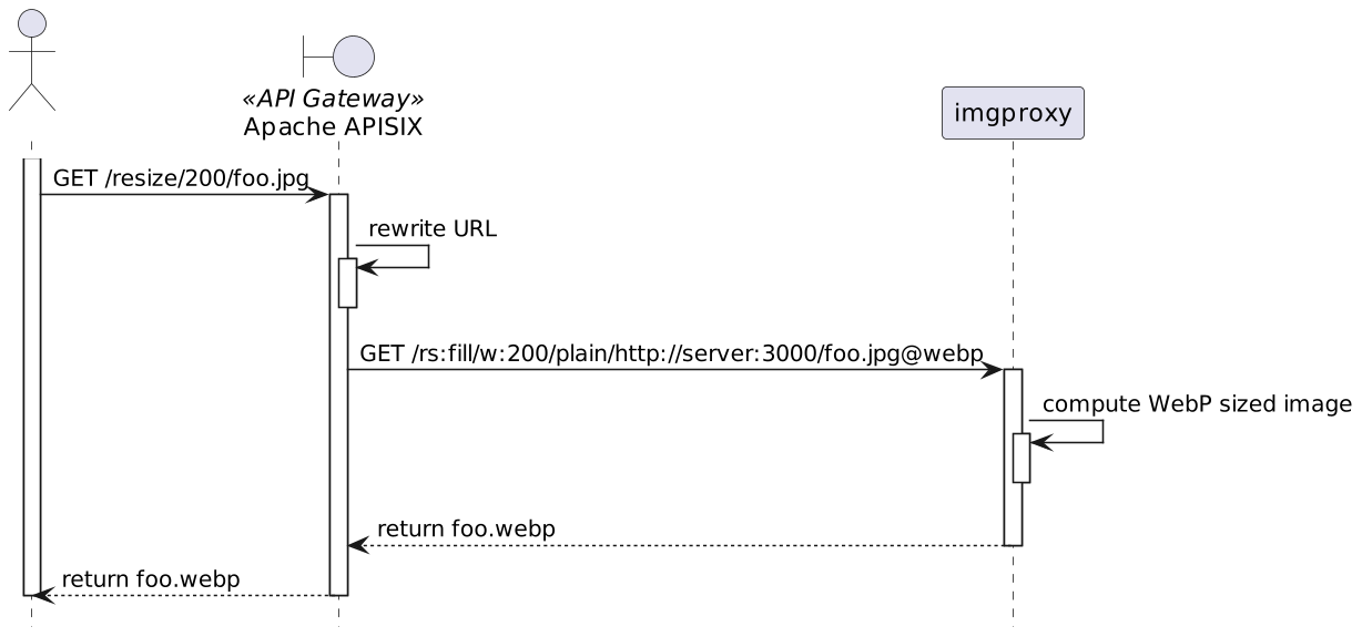
Apache APISIX intercepts requests starting with /resize, rewrites the URL for imgproxy, and forwards the rewritten URL to imgproxy. Here's the overall flow:

The corresponding Apache APISIX configuration looks like the following:
routes:
  - uri: /resize/*                                          #1
    plugins:
      proxy-rewrite:                                        #2
        regex_uri:
          - /resize/(.*)/(.*)                               #3
          - /rs:fill/w:$1/plain/http://server:3000/$2@webp  #4
    upstream:
      nodes:
"imgproxy:8080": 1- Match requests prefixed with
/resize - Rewrite the URL
- Catches the width and the image in the regular expression
- Format the URL for
imgproxy.http://server:3000is the server hosting the original image;@webpindicates a preference for WebP format (if the browser supports it)
With the above, /resize/200/ai-generated.jpg to Apache APISIX is rewritten as /rs:fill/w:200/plain/http://server:3000/ai-generated.jpg@webp to imgproxy.
Testing
We can set up a small testing sample with Docker Compose:
services:
  apisix:
    image: apache/apisix:3.5.0-debian
    volumes:
      - ./apisix/config.yml:/usr/local/apisix/conf/config.yaml:ro
      - ./apisix/apisix.yml:/usr/local/apisix/conf/apisix.yaml:ro
    ports:
      - "9080:9080"
  imgproxy:
    image: darthsim/imgproxy:v3.19
  server:                                                         #1
build: content- Simple web server hosting the HTML and the main image
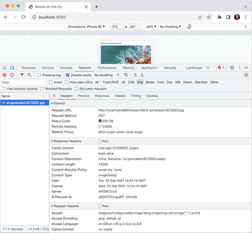
We can now test the above setup with the browser's Developer Tools, emulating small screen devices, i.e., iPhone SE. The result is the following:

- Because of the screen resolution, the image requested is the 400px width, not the original one. You can see it in the request's URL
- The returned image is in WebP format; its weight is 14.4kb
- The original JPEG image weighs 154kb, more than ten times as much. It's a lot of network bandwidth saving!
Discussion
Cutting your storage costs by ten is naturally a great benefit. However, it's not all unicorns and rainbows. Computing the resized image is a compute-intensive operation; it costs CPU time for each request. Moreover, however efficient imgproxy is, it takes time to create the image. We traded storage costs for CPU costs and now incur a slight performance hit.
To fix it, we need a caching layer in front, either a custom one or, more likely, a CDN. You may object that we will store assets again; thus, storage costs will rise again. However, a considerable difference is that the cache works only for used images, whereas we previously paid for storing all images in the first solution. You can also apply known recipes for caching, such as pre-warming, when you know a group of images will be in high demand, e.g., before an event.
Conclusion
In this post, we described how to use Apache APISIX with imgproxy to reduce the storage cost of images in multiple resolutions. With caching on top, it adds more components to the overall architecture but shrinks down storage costs.
This post was inspired by Andreas Lehr's talk at StackConf.
The complete source code for this post can be found on GitHub.

Comments